
Where Can I Get Pictures for Talks?
Should your talk have images? Yes! Lots!
Before going further, stop reading this and go read the Noun Project primer on visual design for presentations. It’s got great general advice about how to make presentations look good, and also some great ‘before and after’ examples showing how to replace bullet points with images. Design matters! Presentations with good visual design aren’t just prettier; they’re also more effective.
What is the purpose of images?
Images in presentations are valuable in several different ways, and the best part is they can bring all the value all at once.
 Pictures make talks better. Fact.
Here are some of the different functions of images:
- Aesthetic pleasure for the audience
- Reinforce your message via visual channel
- Improve audience retention, because of the picture superiority effect
- Hold an audience’s attention by having something change on screen
- Cue for the presenter (me) about what I should be saying
The last one is important, because I try and keep the number of words on my slides low. Without words, how do I remember what I’m supposed to be saying? I’m not one of those people who can talk coherently without notes or prompts. What works for me is to build out my story with pictures, and then change slides rapidly. As a rule of thumb, I aim for two or three slides a minute, with only a couple of words per slide. The images give the talk (and me) structure.
Sourcing images
Images are great, but there’s a problem. For most of us, making new words is easy, but making new pictures is hard. Like, really hard.
The good news is, this doesn’t need to stop you having lots of pictures in your talks. No matter how un-artistic you are, you have three kinds of visual content available to you:
- Icons
- Drawings
- Photos
Here’s how I source them, along with some of their advantages and disadvantages.
Icons
Don’t underestimate the effectiveness of a single over-sized icon or emoji on a slide. Here are some places to find them:
- Your operating system’s built-in emojis (free, but limited)
- The Noun Project (icons need to be paid for, or attributed in really big text; but a subscription can be worth it, because there’s a huge selection)
- FontAwesome (free, if you stick to the free set)
- IBM’s Carbon design icons (free, but limited selection)
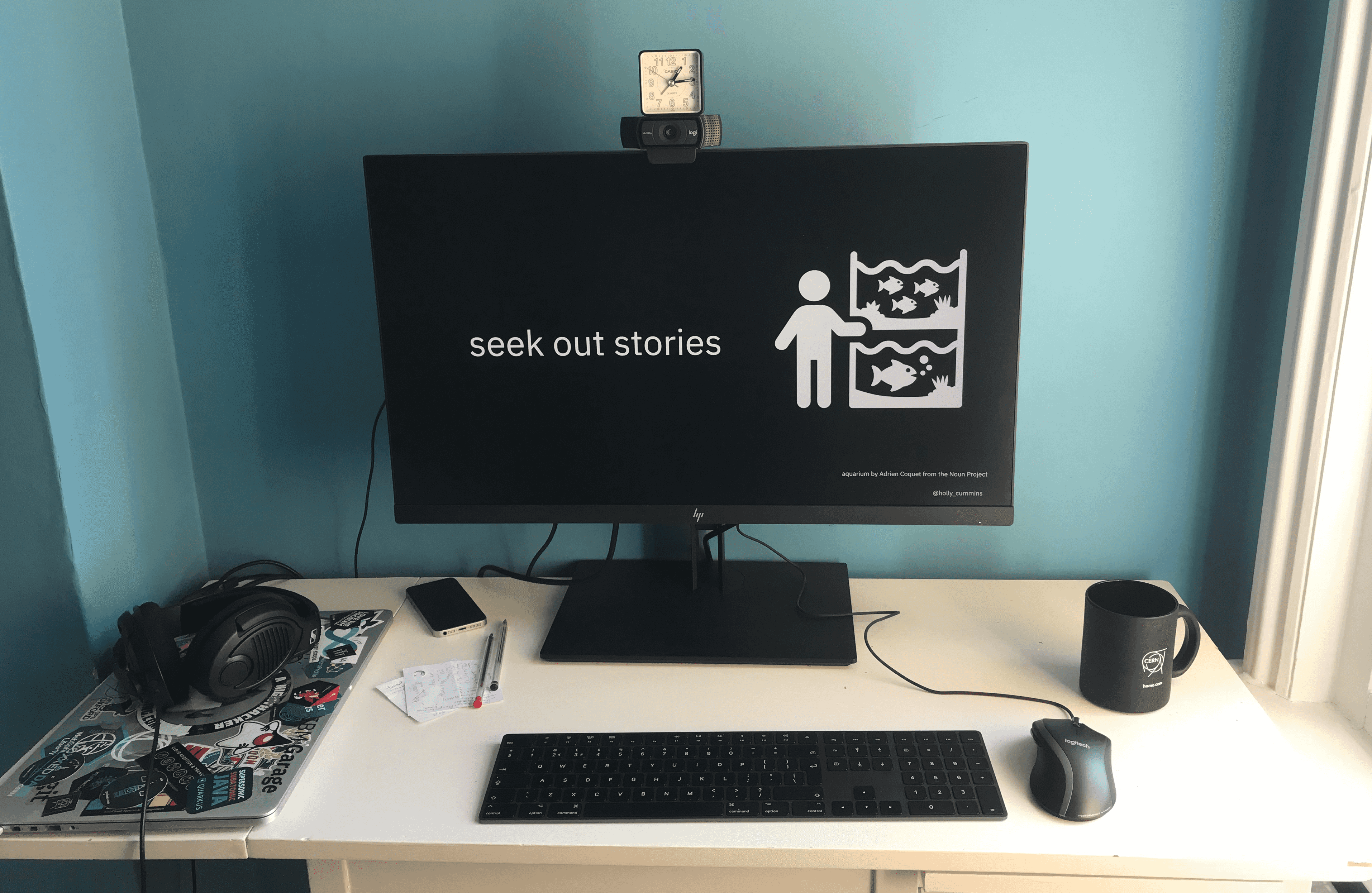 The Noun Project have icons for everything, including aquariums. For this slide, I combined two oversized icons. The
aquarium comes in because I was talking about a project where we used AI to count pet fish.
The Noun Project have icons for everything, including aquariums. For this slide, I combined two oversized icons. The
aquarium comes in because I was talking about a project where we used AI to count pet fish.
Note that icons are not the same as clip art. Tastes change; at the moment, icons look stylish, and clip art looks unacceptably dated. Hopefully this is obvious, but just don’t go there with anything that looks like it might possibly have once been clip art.
Drawings
Drawing it yourself is a great way of generating images for a presentation. “But I can’t draw,” I hear you wail. I can’t draw either, but practice and a series of cheat’s techniques have helped me a lot. I’ve written up my tips for getting started with drawing in “How to Draw When You Can’t Draw”.
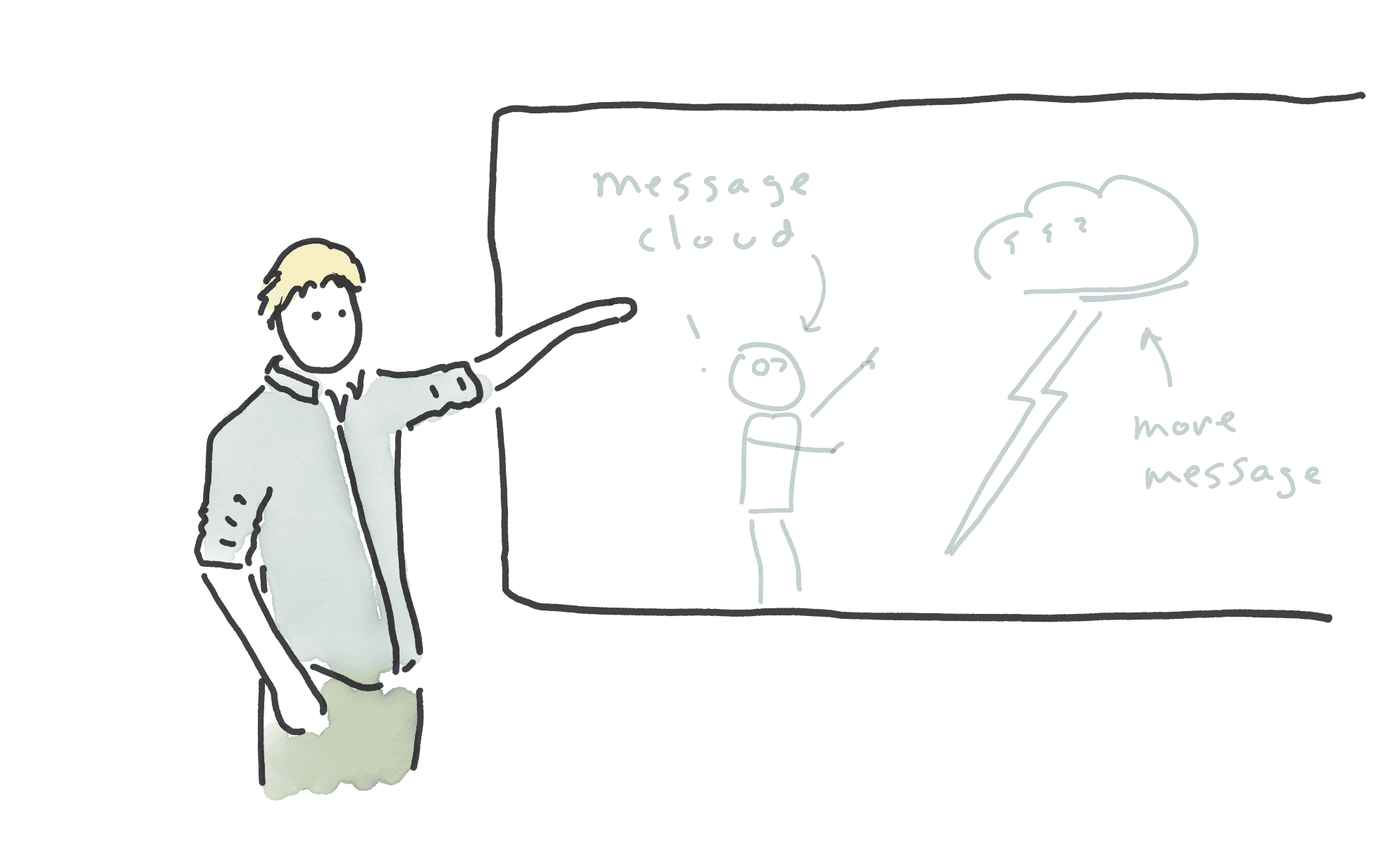
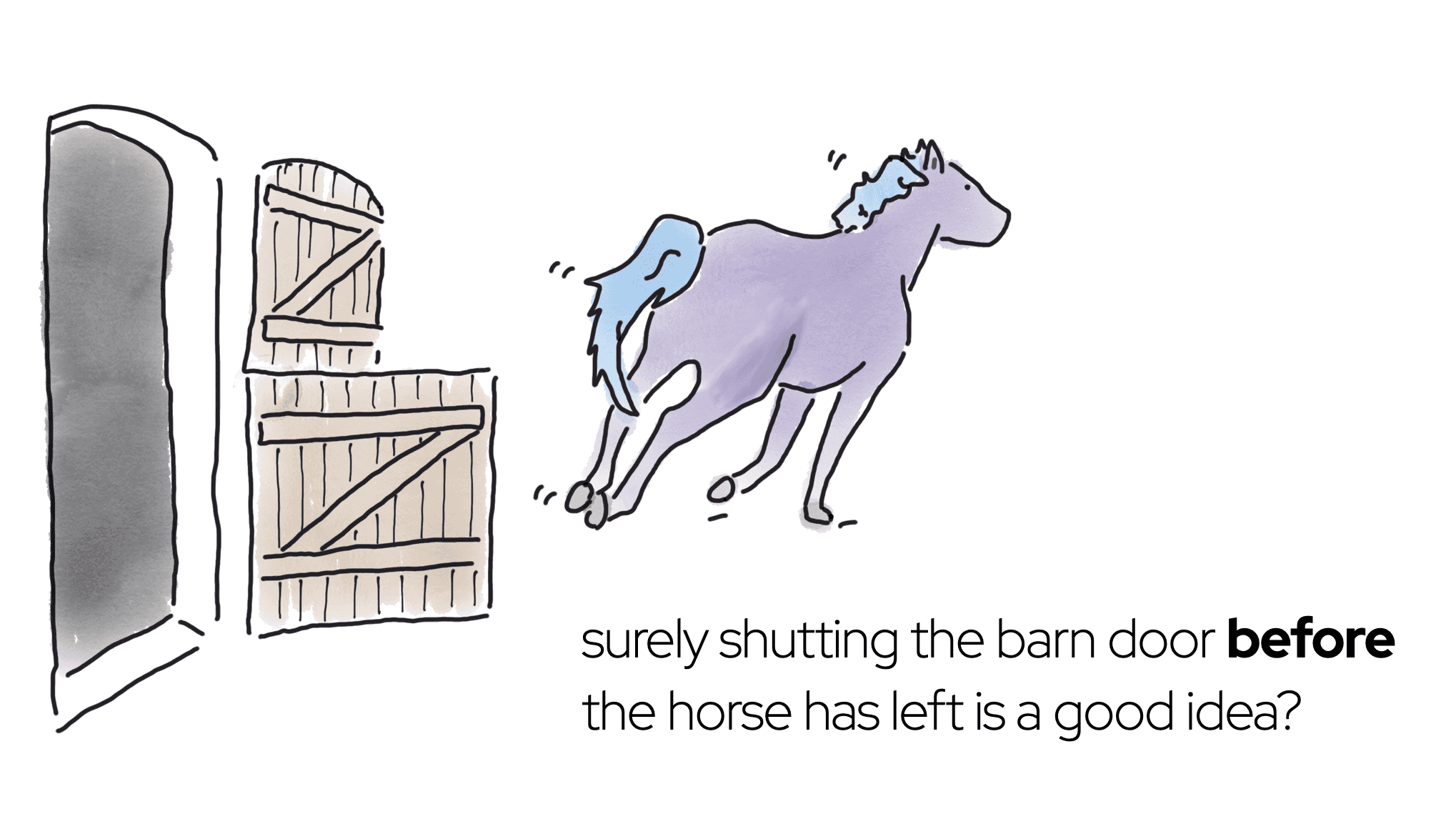 A 2022 slide about the impact of heavy governance on IT
provisioning behaviour, illustrated by me. Being able to draw something was useful, because it would have been pretty
hard to find a photo of a horse running away from an open barn door. The fact that I could sneakily make the escaping
horse look a bit like a Charity-Majors-approved My Little Pony was a bonus.
A 2022 slide about the impact of heavy governance on IT
provisioning behaviour, illustrated by me. Being able to draw something was useful, because it would have been pretty
hard to find a photo of a horse running away from an open barn door. The fact that I could sneakily make the escaping
horse look a bit like a Charity-Majors-approved My Little Pony was a bonus.
But honestly, drawing skill isn’t necessary. Some of the most effective presentations I’ve seen are Felienne Hermans’s. I don’t think she’d mind me saying that her drawings are not especially skilled, but they work very very well to convey her message.
 Felienne Hermans at GOTO Amsterdam, June 2022
Other people’s drawings
When it comes to drawings, your own are always best, even if they’re, technically speaking, the worst. However, if you really don’t want to go there, Coco Material is a sweet little library of open source illustrations. Some of them do look a bit clip-art-y, so choose carefully. Because the drawings are simple, the Coco Material site is also a great learning resource. Study the drawings: how did they make that bottle of soya sauce so unmistakable with just a few coloured areas? How did they give that cat so much expression with just a few lines? The Coco Material license would also allow tracing, if you wanted to split the difference between drawing your own and re-using someone else’s.
Photos
I used to use a lot of photos in my presentations, but I’m now slightly cautious with them, for three reasons. The first is fashion; around ten years ago the best speakers discovered what a good idea images are, and then the rest of us started copying them. At this point in the trend cycle, photo-heavy slide decks risk looking a little dated.
The second reason is that photos have a lot of detail, and detail can distract the audience. A purer, more abstracted, visual communication can make the message clearer (Scott McCloud explains this really well, if you want to read up on it.) Photos with white backgrounds avoid some of the detail problem. Unfortunately, they’re expensive to produce, and so it’s hard to find people giving away this kinds of photo.
The final argument against photos is that they’re pretty static. I like to use lots of animations and builds in my decks. You can’t build up layers or use animations to tell a story with photos. Well, you can’t do that unless you’re a photoshop wizard, which I am not.
Those cautions aside, photos are still good! Remember, I can’t draw, so some things are just too hard to represent in a drawing. Icons lack all detail (by design), so they’re no good for representing complex things.
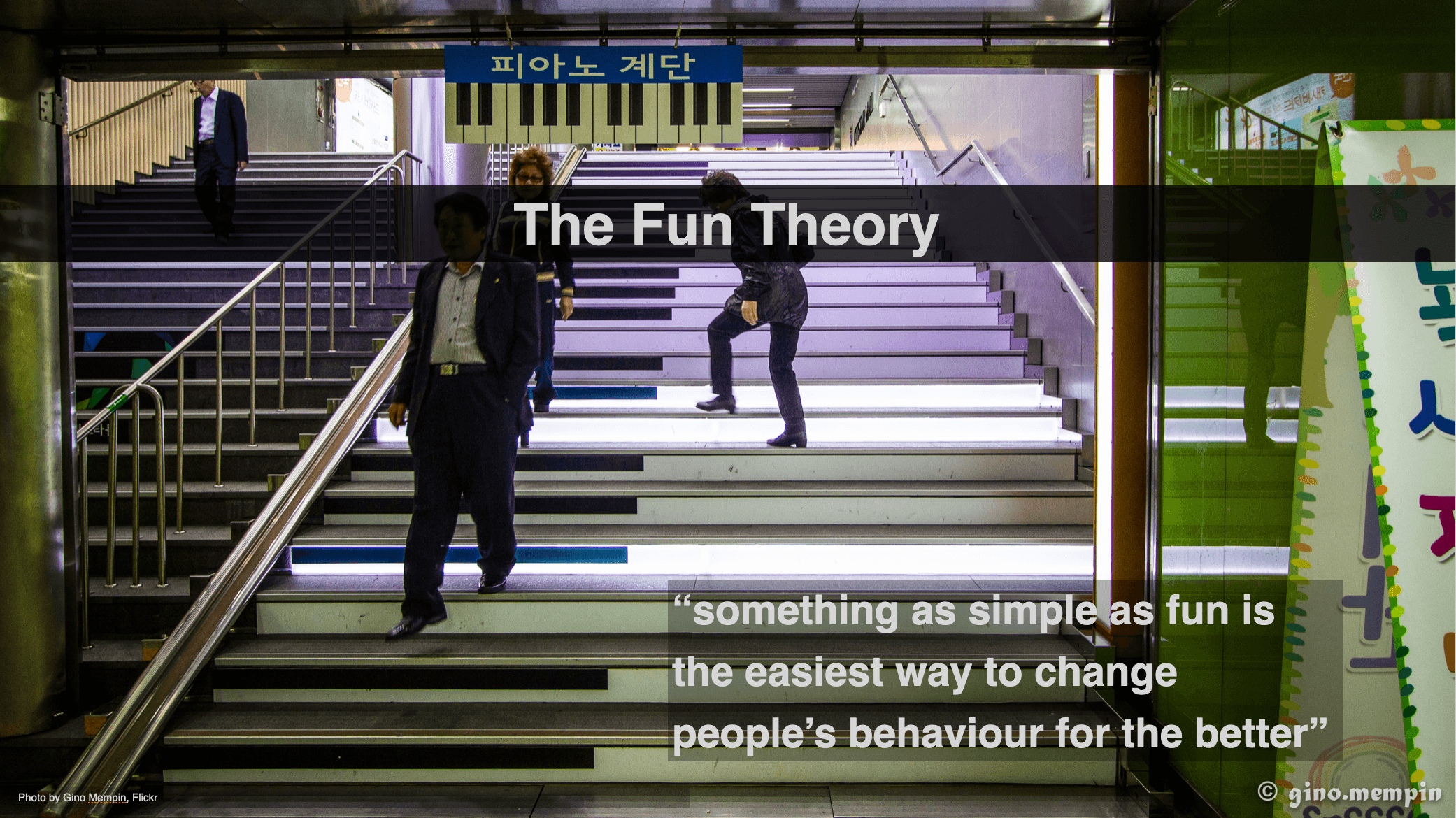 A slide explaining how piano stairs can encourage
people to take the stairs instead of escalators. But what on earth are piano stairs? It would be almost impossible to
communicate what they look like without a photo.
A slide explaining how piano stairs can encourage
people to take the stairs instead of escalators. But what on earth are piano stairs? It would be almost impossible to
communicate what they look like without a photo.
I usually get my photos from Unsplash. It’s also worth considering stock images, which can be pretty affordable. Be cautious with other sources, which are vulnerable to copyright predators or the opposite, image theft. Also be cautious of Unsplash images with identifiable people in them ( where a model release might be needed).
I sometimes also use Flickr, but check the license carefully. It’s best to search by license, and then search by “Commercial Use Allowed”. That should bring up images with Creative Commons Attributions licenses; but be careful to attribute correctly. I usually avoid Creative Commons Share Alike for my presentations, since I don’t necessarily want to release them under a creative commons license.
Two sources of public domain images I’ve recently discovered are public.work (a beautiful aggregator) The Library of Congress free-to-use archive. The images tend to have a vintage feel (because they’re older and thus out of copyright), but there are also some new ones. There’s a range of bridges, public service posters, landmarks, and all sorts of other potentially useful images.
For example, these are two of my favourites, and I can imagine using either in a talk:
 A woman operating a hand drill
at Vultee-Nashville, 1943. With the red head scarf, it gives the impression of a real-life Rosie the riveter. I love the
contrast between the impeccable manicure and heavy industrial context.
A woman operating a hand drill
at Vultee-Nashville, 1943. With the red head scarf, it gives the impression of a real-life Rosie the riveter. I love the
contrast between the impeccable manicure and heavy industrial context.
Many of the images in the Library of Congress archive would give a slide a dignified or inspiring mood, but not all. There’s a whole category for cats:
 A cat, improbably wearing a winged helmet and breastplate armor in the role
of the valkyrie Brünnhilde from the opera Der Ring des Niebelungen, 1936. I wonder if the cat also sang?
A cat, improbably wearing a winged helmet and breastplate armor in the role
of the valkyrie Brünnhilde from the opera Der Ring des Niebelungen, 1936. I wonder if the cat also sang?
Visual consistency
Aim for consistent visual style, or a limited mix. Having icons on one slide and drawings on another can look sloppy and unpolished. One of the first things I think about when starting a talk is whether a topic is best suited to icons, or drawings, or photos. That ensures I don’t spend time making drawings which I later have to rip out and replace with photos, or the other way around.
AI Image Generation
What happens if you’re trying to stick to a style, but you can’t find what you need? I’ve started experimenting with tools such as DALL-E or Stable Diffusion for generating images. Sometimes the results are astonishingly great, and sometimes they’re entertainingly awful.
I think we can all agree this is not the Duke, the Java mascot, with grey hair and a beard:
 DALL-E output for “A version of the Java Duke Mascot, but with grey hair and a
beard”. Yes, the text appears to say JAJAAVVE.
DALL-E output for “A version of the Java Duke Mascot, but with grey hair and a
beard”. Yes, the text appears to say JAJAAVVE.
On the other hand, if you need a photo of a duck wearing a fedora, you won’t do better than this unless you’re a skilled photographer with access to well-trained ducks:
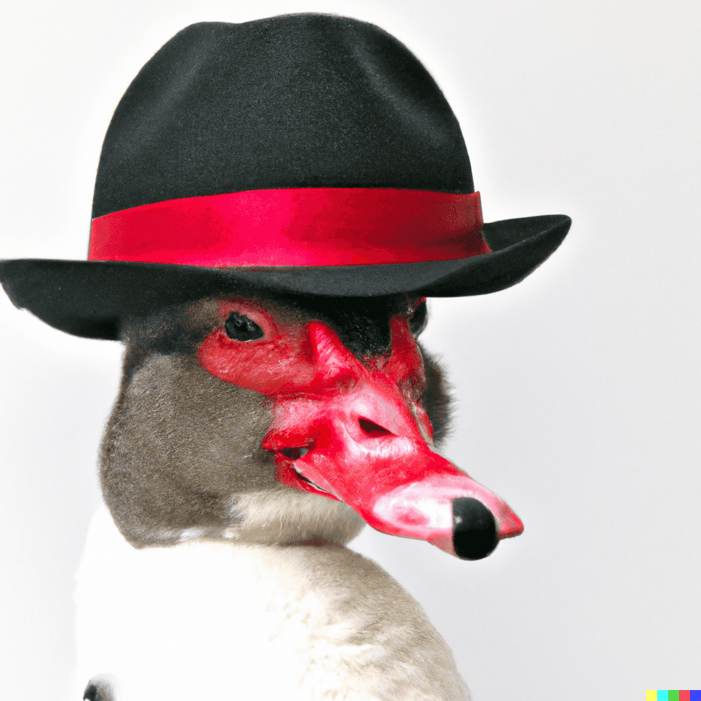 DALL-E output for “photo of a duck wearing a red fedora white background”
Although image generation is cool, be aware that generating images is energy intensive, and most generators were trained by scraping copyrighted artists’ work without compensation. That’s less cool.
Hybrid styles
Sometimes it just doesn’t work to stick to only-photos or only-drawings. It can be quite effective to layer line drawings or icons over photos. It can also look fresher and more modern than plain photos. For an example, take a look at the first image in this Noun Project article, or this slide, where the fire icon reinforces the meaning of the fire photo:
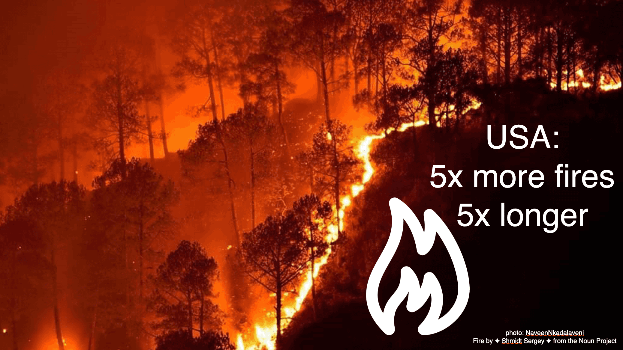 A slide from a 2019 talk. The icon and image reinforce each other.
On the other hand, in this slide the photo and icon are complementary. The photo contributes one piece of information ( what a Bramble Cay melomys looks like, because people are unlikely to know), and the icon adds extra context (uh oh, it’s extinct).
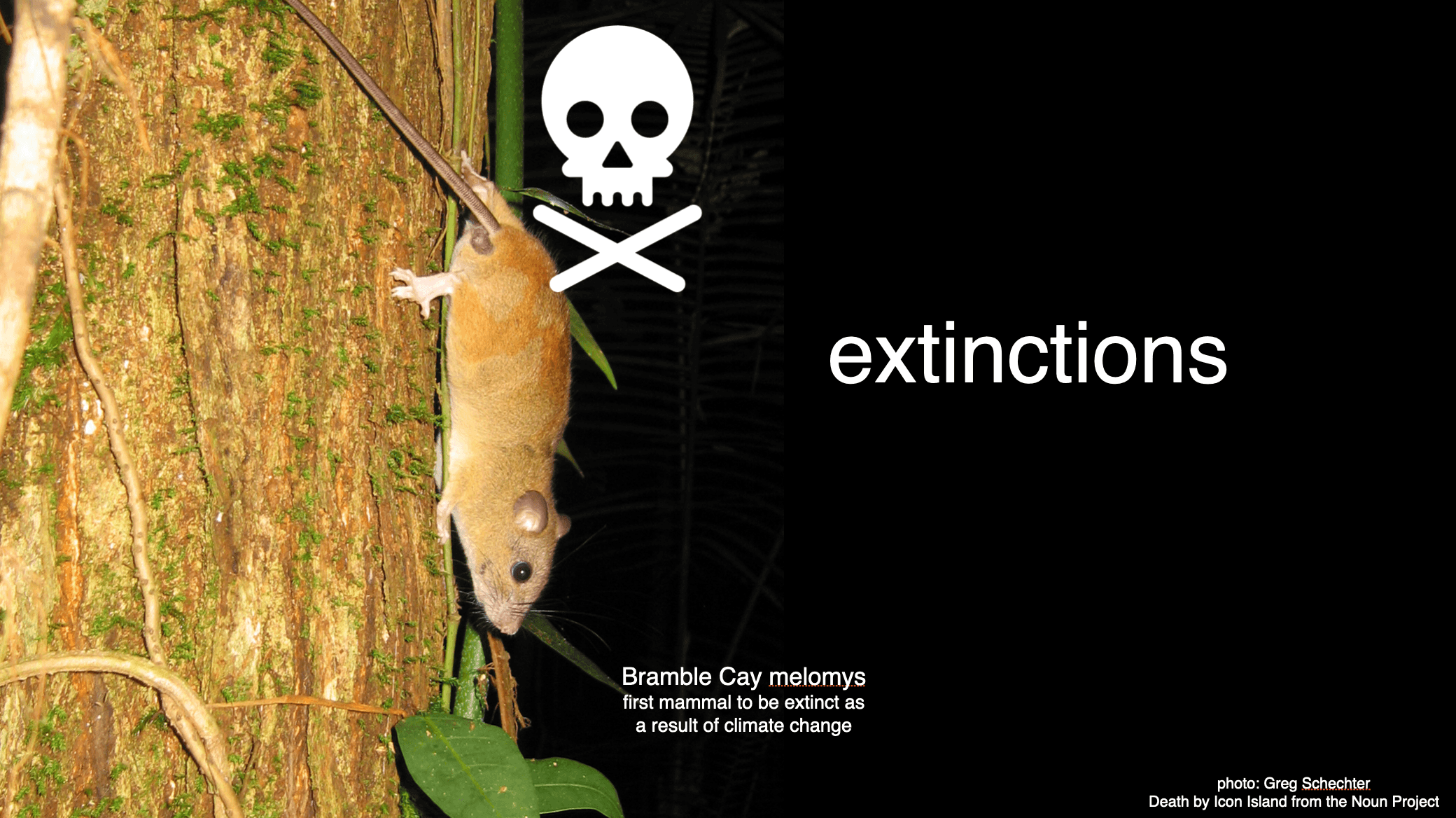 Another slide from the same talk. The icon
and image each tell a different part of the story.
Another slide from the same talk. The icon
and image each tell a different part of the story.
Image selection
We’ve talked a lot about how stuff looks. But what about the actual content of the pictures?
Figuring out what image goes with what concept is hard! Sometimes I have a good idea when drafting out the talk, but more often I draw a blank (do you see what I did there?!). When I’m stuck, I just leave a ‘TODO graphic here’ and then alternate runs and showers until inspiration hits. When choosing an image, think about the purposes of the image; does it need to convey extra meaning, or is it just there to entertain the audience?
Some topic-and-image associations have become clichéed. Instead of choosing a predictable image, can you find something unexpected which will add an extra layer of meaning, or make people laugh with an incongruous association? For example, if the topic is “working at home”, the obvious image might be a desk with a computer on it, but maybe you could show an unmade bed, or a pair of comically fluffy slippers. When I talk about under-utilized servers, I don’t show pictures of data centres or load meters; instead, I take the opportunity to draw cute zombies.
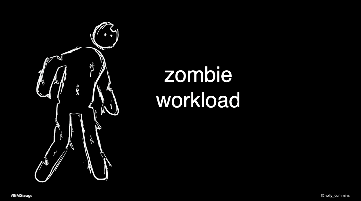 A slide from 2020, with a hand-drawn zombie. Notice that the visual style
combines the shape of icons and a rough hand-drawn finish. I traced icons to get some of the proportions right.
A slide from 2020, with a hand-drawn zombie. Notice that the visual style
combines the shape of icons and a rough hand-drawn finish. I traced icons to get some of the proportions right.
Here’s a later zombie illustration, conveying the same idea in a different style.
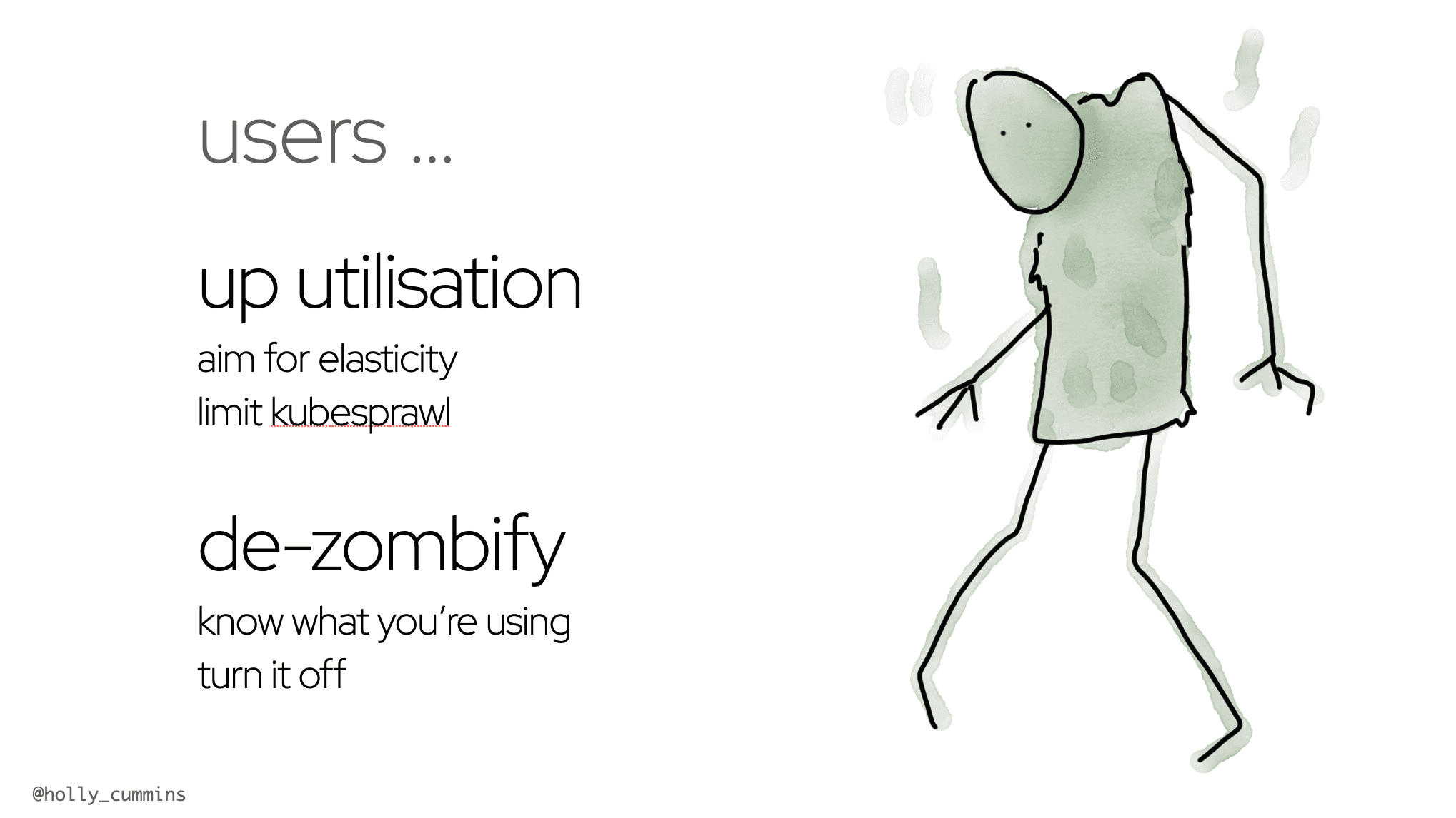 Another zombie slide, from 2023. The zombie looks a little bit like a grinch,
which wasn’t my intention, but at least it makes people smile.
Another zombie slide, from 2023. The zombie looks a little bit like a grinch,
which wasn’t my intention, but at least it makes people smile.
Have I mentioned already that I’m not an expert on this? I attempt to draw a zombie and end up with a grinch. I’ve shared the patterns that work for me, but styles evolve, so I expect in a few years time I’d have a different set of recommendations. I aim to keep experimenting, and when I see a visually effective talk, I try and figure out what makes it work. There’s no right answer, but we can always learn from others. As a final reference, Understanding Comics by Scott McCloud is notionally about comic books, but it’s actually a great deep dive into drawing and visual communication. I loved it.